
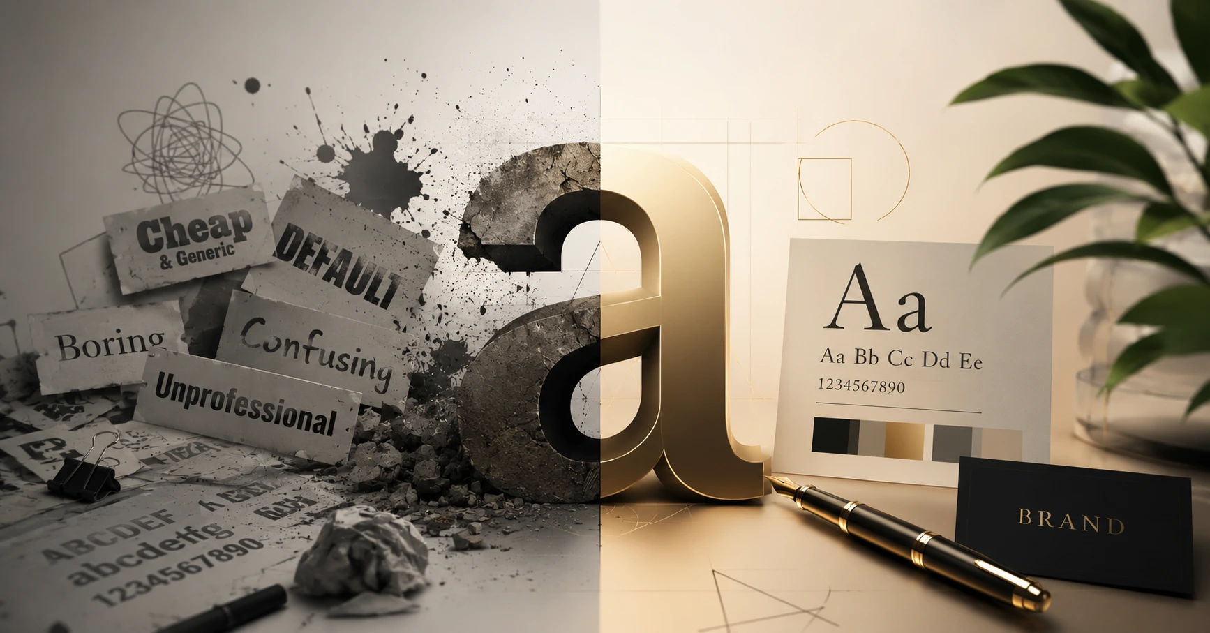
When business owners and new designers think about brand design, they usually focus almost entirely on the logo mark, the color palette, or the imagery. They treat typography as an afterthought—simply picking a font that looks "clean" or "cool" on their computer screen and moving on.
This is a massive mistake. In the world of visual communication, typography is the invisible voice of your brand.
Every typeface carries an emotional weight and a psychological message. Before a user even reads the actual words on your website, packaging, or ad banner, their brain has already formed an impression of your business based entirely on the shape of your letters. Choosing the wrong font won't just look sloppy—it can actively confuse your customers and destroy your brand's credibility. Let's look into the basics of typography and how to choose fonts that align with your business goals.
1. The Core Families: Serif vs. Sans-Serif
To understand typography, you first need to understand the two primary font classifications that dominate the corporate design landscape:
Serif Fonts (The Traditionalists)
Serif fonts feature small decorative lines or "feet" at the ends of their letter strokes. Classic examples include Times New Roman, Georgia, and Garamond.
The Psychological Message: Authority, tradition, trust, sophistication, and academic heritage.
Best Used For: High-end legal firms, historical institutions, luxury brands, and long-form editorial print layouts (like newspapers and books) where the "feet" help guide the human eye across text lines.
Sans-Serif Fonts (The Modernists)
"Sans" literally means "without" in French. Sans-Serif fonts strip away the decorative feet, leaving clean, geometric, uniform line weights. Classic examples include Helvetica, Arial, Roboto, and Inter.
The Psychological Message: Modernity, minimalism, cleanliness, tech-forward thinking, and approachability.
Best Used For: Technology companies, startups, mobile applications, and digital screens where clean lines stay highly legible even at tiny, compressed resolutions.
2. The Danger of Personality Mismatches
The quickest way to ruin a professional layout is to pair a high-quality brand message with a font family that contradicts it psychologically.
Imagine walking into a premier corporate law office in Mangalore and receiving a legal contract printed entirely in Comic Sans or a playful, handwriting font. Even if the contract is legally flawless, the visual presentation screams unprofessionalism.
Similarly, if you design a modern, playful mobile app targeted at teenagers but style it using an ultra-traditional, heavy Serif font like Playfair Display, the product will immediately feel stiff, dated, and uninviting to its core demographic. Your choice of typeface must match your brand's identity.
3. Prioritizing Visual Hierarchy and Legibility
Great typography balances personality with functional usability. When organizing text on a layout, professional graphic designers rely on two fundamental rules:
Establish a Clear Hierarchy: A user should instantly know where to look first. Use size, weight, and contrast variations to separate your text levels. Your main H1 header should be bold and prominent, subheadings should be slightly scaled down, and body text should be clear and highly readable.
Limit Your Font Count: A common amateur mistake is using four or five different fonts on a single page to make it look "creative." This creates visual chaos. Stick to a maximum of two font families per brand: one distinct, expressive font for headlines, and one highly legible, neutral font for body paragraphs.
Launch Your Creative Career with Zen Institute
Mastering design requires moving past software tutorials to understand the fundamental laws of visual psychology, composition, grid systems, and typography. Brands do not hire people who just know how to use digital software buttons; they hire designers who can elevate their business identity.
At Zen Institute Mangalore, our elite Graphic Design Course is built to turn creative individuals into high-value visual strategists.
Led step-by-step by senior design directors currently managing major corporate brand portfolios, our practical curriculum guides you through mastering Adobe Photoshop, Illustrator, and InDesign. You will learn the core science behind font pairing, layout theory, color systems, and physical print production constraints while building an authentic, client-ready design portfolio.
Alongside your industry-recognized certification, every student receives complete career support—including portfolio reviews, professional resume optimization, mock client presentations, and direct job referrals to our extensive network of local and national agency partners.
Frequently Asked Questions (FAQs)
1. Why is typography important in graphic design?
Typography plays a key role in shaping a brand's identity and communication. The right fonts improve readability, convey the brand's personality, and create a strong first impression with customers.
2. What is the difference between Serif and Sans-Serif fonts?
Serif fonts have decorative strokes at the ends of letters and are often associated with tradition and professionalism. Sans-Serif fonts have clean, simple lines, making them ideal for modern brands, websites, and digital interfaces.
3. How many fonts should I use in a design?
It is recommended to use no more than two font families in a design—one for headings and another for body text. This creates a clean, consistent, and professional appearance.
4. How does typography affect brand identity?
Typography influences how people perceive a brand. Choosing fonts that match your brand's personality helps build trust, improve recognition, and create a consistent visual identity across all marketing materials.
5. How can Zen Institute help you master typography and graphic design?
Zen Institute's Graphic Design Course provides practical training in typography, branding, layout design, Adobe Photoshop, Illustrator, and InDesign, along with portfolio development, certification, mock interviews, and placement support.